Picture this. You’ve been at the beach with your friends all day, and can’t wait to get back to the nearest shower. You manage to be the first one to sneak off and claim the bathroom to yourself. Finally; the moment you’ve been waiting for. You decide to go ahead and turn the water on… I said, you decide to go ahead and turn the water on…
…What are you waiting for? Turn the warm water on already!
Have you ever found yourself in a situation like this?
It’s been three full minutes and you’re still wrapped in a towel with one hand under the shower head trying to get the temperature right, but to no avail. Scalding hot. Arctic cold. Nothing in the middle. And why is the water barely trickling out? What are you doing wrong? This isn’t the first time you’ve been in a situation like this. And don’t worry — it’s not you, it’s them.
Shower heads are notoriously known for being difficult to operate.
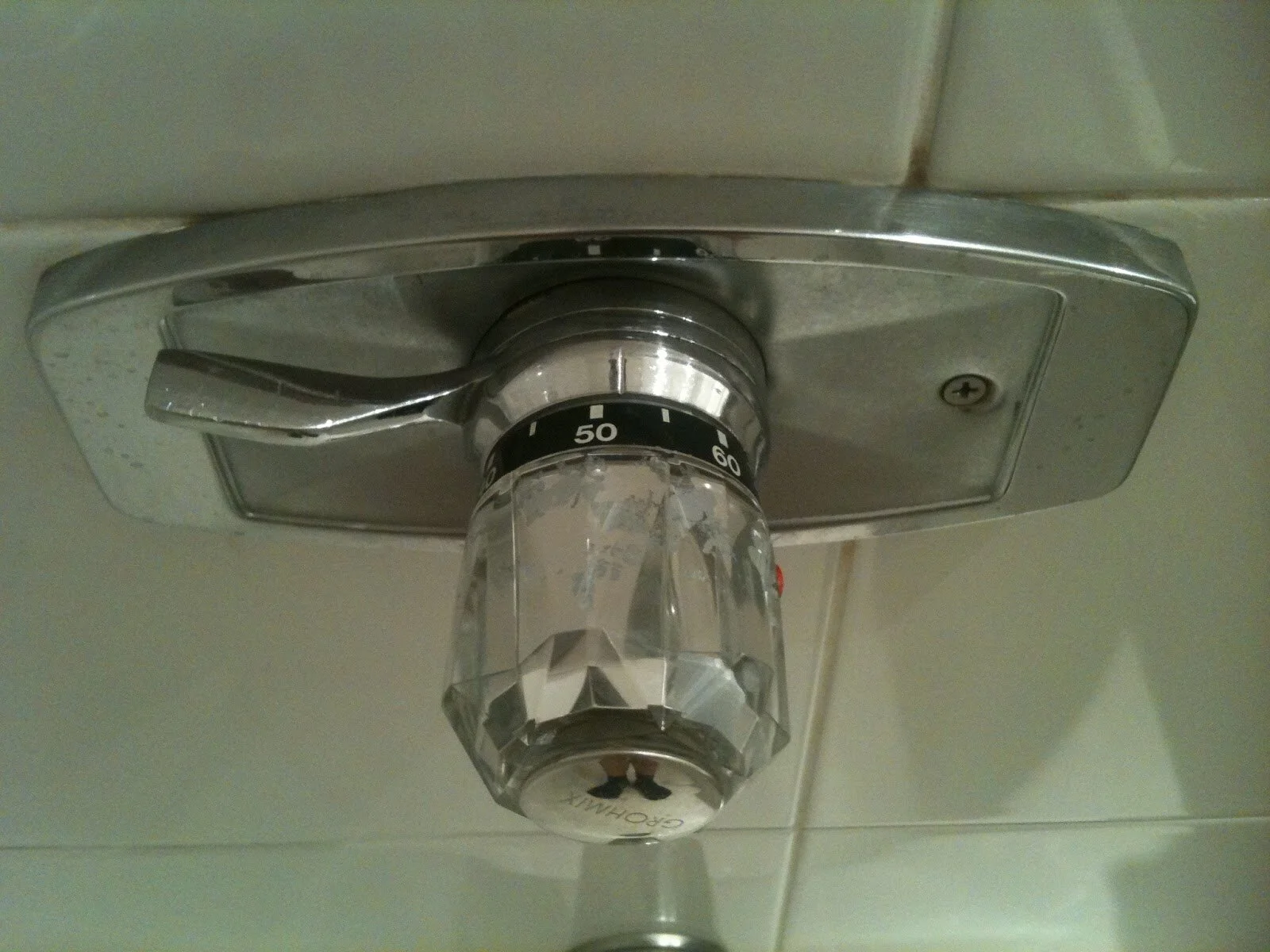
There are many reasons why this design fails its end user. Certain artifacts have culturally informed conventions: usually known as affordances. Simply said, this is how we expect things will work. This product design very clearly neglects all affordances and seems to operate on its own misunderstood rule book.
The assembly provides no commonly understood signifier to provide the user a sense of temperature. And, the valve handle above the knob has no concise purpose. Little would a user know that moving the valve left to right would actually control water pressure.
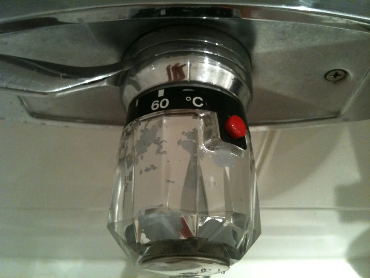
Next, you’ll notice a red button located to the right of the temperature knob.
Little would a user know that in order to generate warm water, the button must be pressed and the knob turned to a desired setting. If this button were to be depressed at any point… it reverts back to the coldest setting. Not the kind of chilling you expected to be doing, huh?
To be clear — this post is not to say an artistic shower setup doesn’t have a place in this world. Generally a home setting is the place, however, to explore more complex and stylistic designs because you’ve got time to learn and become comfortable with the configuration. To us, it’s just common sense to place a simply understood and very basic assembly in a hotel room, where people are only staying for short stints of time. Understanding the context of a product’s purpose will normally inform the need for either form or function-heavy design, whichever seems most necessary given the situation.
This is one case of many where user centricity is nothing but a foreign term. This assembly showcases a careless design scheme, poor control mapping, and inconsiderate functionality. Interacting with a product of this nature just invites anxiety… during my shower time, which generally is supposed to be a time of relaxation. C’mon!
Shower assemblies… clean up your act. We can’t afford any worse of a design.


